


Artist Research on colour
- brockjones637
- May 26, 2021
- 3 min read
1024 Colours Gerhard Richter Original Title: 1024 Farben Date: 1973 Style: Conceptual Art, Op Art Theme: Colour Charts Genre: abstract Media: oil, canvas
1024 colours (1973) is one of Richter’s well-known colour chart paintings, which he began producing in the late 1960s. They were inspired by the commercial colour charts found in hardware stores. Here, the different colours have no particular meaning or significance. He used colour as a “readymade”,an object found in the hardware store and another part of consumer culture.
Even though the painting mimics a commercial colour chart, the colours are not grouped in the same order. Instead, the painting was created through a predetermined mathematical system, and the colours were distributed at random across the grid. The white lines that form the grid are equally spaced, and each colour occupies equal space within the painting. This kind of distribution points to indifference and meaninglessness: it is part of the artist’s premise that it is impossible to combine colours in a meaningful way.
Gerhard Richter Biography, Art, and Analysis of Works | The Art Story: www.theartstory.org 26/05/2021

ARTIST Gerhard Richter born 1932 ORIGINAL TITLE Abstraktes Bild (809-3) MEDIUM Oil paint on canvas DIMENSIONS Support: 2300 × 2048 × 75 mm COLLECTION ARTIST ROOMS Tate and National Galleries of Scotland
From the mid 1980s, Richter began to use a home-made squeegee to rub and scrape the paint that he had applied in large bands across his canvases. He spread the paint over the surface and integrated the various colours with each other.
In the 1990s the artist began to run his squeegee up and down the canvas in an ordered fashion to produce vertical columns that take on the look of a wall of planks. ‘Abstraktes Bild (809-3)’ is typical of these paintings.
One effect of the use of the squeegee was to create a blurring of one area of colour into another – similar to the blurring in Richter’s earlier photo-paintings – so that one has the feeling of looking at an out of focus image, that lies tantalisingly beyond decipherment.
Abstraktes Bild 599 – Gerhard Richter
Gerhard Richters work is a exciting ,his use and process of applying paint to a canvas is in my opinion beautiful and elegant. He captures an essence.
His use of colour in his works walk the line between paintings and photography, one of the most important developments in art in the past century.
He has never really adhered to a specific style or movement; nor has he stuck to a single medium. Richter has made art that is aware of its own limitations, and played with the idea of chance in photography and painting. His impact on the art world is undeniable.
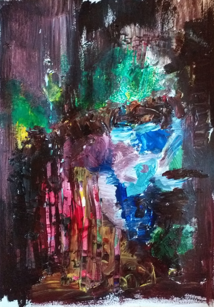
Mixed media sketch on acrylic paper Penny Efstathiou 2021
I created this loose sketch using a palette knife and loaded it with paint in primary colours. Scraping back the wet layers to leave heavy lines in the paint . experimenting with the way Gerhard Richter did creating vertical columns that look like a wall of planks. I am pleased with this sketch it has a landscape feel to it.

Mixed media on liner wallpaper Penny Efstathiou 2021
This sketch was experimenting with the action painting technique (Jackson Pollock)I think the loose pink lines have a movement to them like running.